Stage & Utilities
Deep dives into every tool on stage
Stage & Utilities
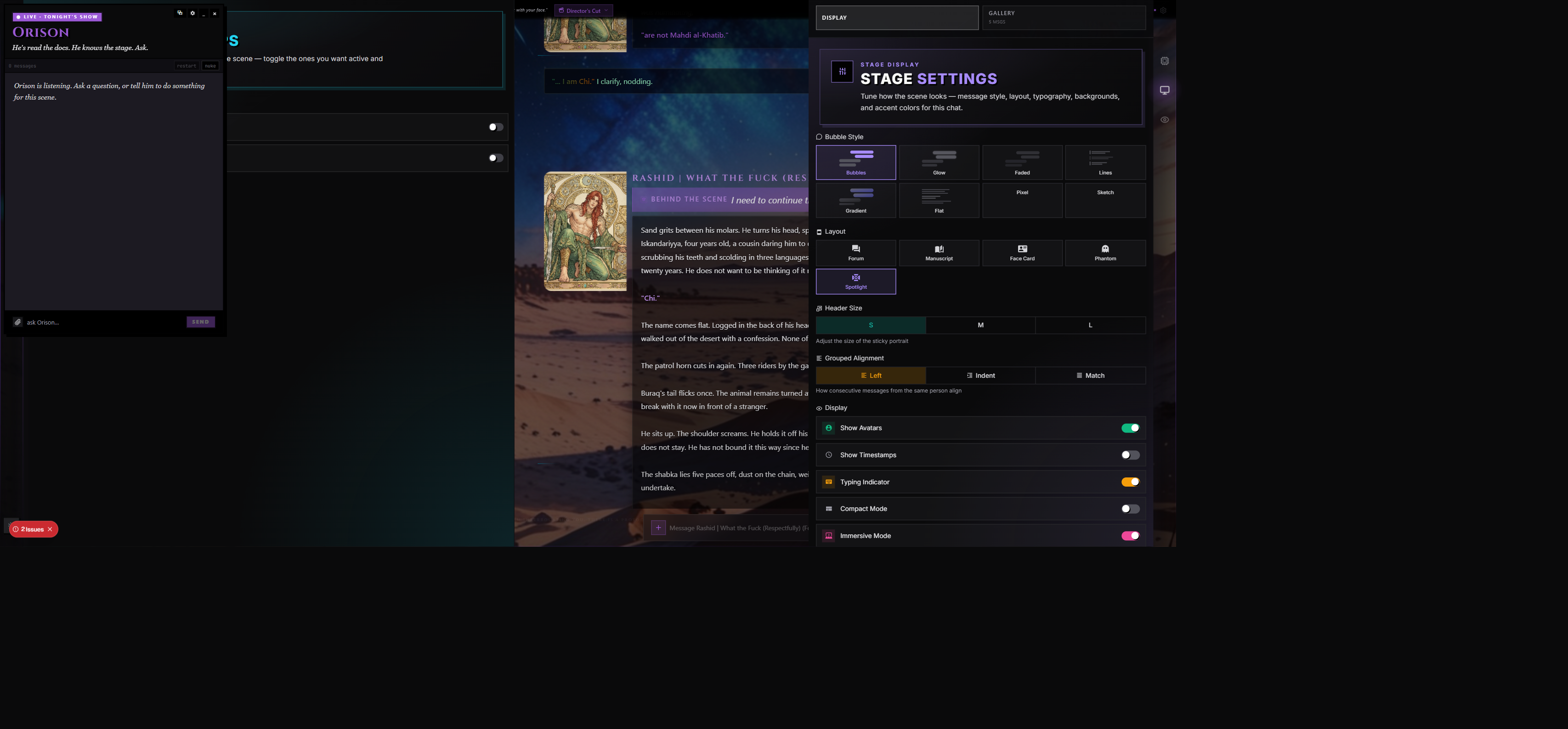
Most of what shapes a scene happens in the message stream — but the rails on either side of the chat hide a set of panels that change the look, the prompt, and the quiet machinery of a session without ever touching the conversation itself.
This page covers the wings under the Stage, Stagecraft, and Inspector groups, plus a handful of in-chat utilities that polish the writing experience.
The chat actions themselves — Continue, Swipe, Correct, Polish, Impersonate, Edit, Delete, Stop, Spellcheck, and Guided Swipe — live on the message row and the compose bar. They're documented in Scenes & Chat.
Stagecraft — Props and Stage Tools
Stagecraft is RoleCall's plug-in system for scenes. A Prop is a self-contained augmentation that rides along with the scene — it can inject prompts, expose its own panel, or run a small interactive system inside the chat. The Stagecraft Manager wing is where you turn them on and off.
Prop Tiers
Every prop falls into one of three tiers, and the manager surface treats each tier slightly differently.
| Tier | Label | What it does |
|---|---|---|
| 1 | Prompt Pack | A bundle of prompt entries that get injected into the model's context. No panel of its own — toggle it on, and its prompts ride along. |
| 2 | Smart Prop | Like a Prompt Pack, but with a generic settings panel. You can toggle individual prompts inside the pack, adjust simple knobs (numbers, booleans, choices), and the prop persists its own little state across messages. |
| 3 | Full Prop | A complete in-scene system with its own custom panel, its own visual chrome, and its own logic. CarrotKernel and Rabbit Response Team are examples — they look and feel like first-class wings. |
The Stagecraft Manager
Open the Stagecraft wing and you'll see two sections:
- Active — props you've already turned on for this scene, listed with an accent-colored count badge
- Available — every other prop in the catalogue, waiting to be toggled
Each prop is a row with:
- An icon and accent color (the creator picks these)
- The prop's name
- A tier label underneath — Prompt Pack, Smart Prop, or Full Prop
- A toggle switch to enable or disable it for the current scene
- A gear button (Tier 2 and 3 only) to open the prop's own panel
Toggling a prop on adds it to the scene's active props list with a default activation. Toggling it off removes it entirely — its enabled flag flips to false and its panel's gear button disappears. Re-enabling it later restores its previous user config and accumulated state if the prop saved any; otherwise it starts fresh.
Inside a Prop's Panel
Tier 2 props share a generic chrome built from their settings schema. You'll typically see:
- A Settings block — toggles, number inputs, and dropdowns the creator declared in the prop's config
- A Prompts block — the individual prompts the prop ships with, each with its own enable/disable toggle so you can keep the pack but mute one entry
Tier 3 props look and feel however the creator built them. CarrotKernel has its own kernel manager, Rabbit Response Team has its own roster — each is bespoke.
Cross-Device Persistence
Active props, their per-user settings, and any state they accumulate during the scene are saved with the chat. If you switch to another device and reopen the scene, the same props come up enabled in the same configuration. State that a prop builds turn-by-turn (counters, picked options, internal flags) rides along the same way.
Generated Post-Actions
A Smart or Full Prop can register post-actions that fire after each message generation — small tasks the prop wants to run once the AI's response is in. The Stagecraft Manager doesn't expose those individually; the prop's own panel is where you'd toggle them.
Stagecraft and the Prompt
When a prop ships with prompts, those prompts show up in the Prompt Inspector marked with the prop's badge so you can see exactly which entries it contributed. CarrotKernel context, for instance, surfaces as orange-bordered system blocks tagged "CarrotKernel" with sub-labels (Characters, Packs, Sheets, Tags, CoT, Pack Entries).
When NOT to Reach for a Prop
- A Prompt Pack is just structured prompts — if you only need a single prompt entry, the Prompts library is faster.
- Props are scene-bound. For things you want true everywhere (a global writing rule), an Author's Note or a Preset prompt is the right home.
Participant Registry, Character Minds, and Character Voices
The Participant Registry is the shared roster for a scene. It answers one question for every system that needs it:
Who exists in this chat as an actor?
That roster is used by pings, Character Minds, dialogue color attribution, TTS voice routing, and future scene systems. It is not the same thing as Character Minds. Character Minds reads the registry; Character Voices reads the registry; pings read the registry. The registry itself is the base layer.
Where It Lives
Open a scene, then use the Character wing tabs:
| Tab | What it contains |
|---|---|
| Character | The card editor for the active character. |
| Persona | Your persona settings for the scene. |
| Participants | The shared registry for this chat. |
The Participants tab shows the Main Character, other card-backed participants, and chat-private NPCs. A normal one-character scene should start with at least one registered participant: the active character card. NPC rows appear later when the story introduces named people with agency.
What Counts as a Participant
A participant is a character-like actor in the chat: a card character, a named NPC who speaks or acts, or a group/scenario card character when the scene has multiple attached card actors.
These should not become participants: places, rooms, factions, objects, powers, systems, quests, abstract lore, a whole crowd packed into one name, or a scene title. The human user also does not become a participant row; the user appears in memories and relationships as text/context, but RoleCall does not create a "user participant" with moods and drives.
How Participants Are Created
The registry fills from three sources.
| Source | What happens |
|---|---|
| Card seed | When the chat opens or the registry is queried, RoleCall ensures the active card has a card-backed participant row. This is idempotent, so refreshing should not create duplicates. |
| Story tools | When Character Minds or Story Director tooling sees a newly introduced named NPC with agency, it can register that NPC. The name is validated before a row is created. |
| User edits | In the Participants tab, you can rename participants, set or unset the main character slot, assign colors, assign voices, or delete mistaken NPC rows. |
The automatic path is intentionally conservative. It rejects names that look like places, systems, broad scene labels, structured tags, multiple entities, or instructions. It also checks for likely duplicates before inserting.
Duplicate Matching
RoleCall tries to avoid obvious duplicates without silently making risky identity decisions. It checks exact names, case/spacing differences, reversed names such as Gojo Satoru and Satoru Gojo, short/long aliases when there is exactly one clear match, and small typos on longer names.
If a match is ambiguous, RoleCall does not guess. The safer behavior is to leave the row visible so you can rename, delete, or merge it later instead of having the wrong actor inherit another actor's memories, color, or voice.
Main Character Behavior
The Main Character slot is the card-backed lead for the scene. That participant uses the card's own signature color/gradient as the default visual identity. Participant colors do not overwrite the main card gradient.
If an NPC's name closely matches the active card name, the Participants tab can suggest that NPC for the main slot. This is for upgraded or older chats where the story created a text-only NPC row before the card-backed participant existed.
Character Voices
Character Voices lives in StageProps as a parent toggle with two suboptions.
| Toggle | What it does |
|---|---|
| Character Voices | Enables the feature family. Without this, participant colors and voices are visible registry data but do not affect dialogue rendering or TTS playback. |
| Signature Colors | Lets participant colors affect per-speaker dialogue styling. |
| TTS Voices | Lets participant voice assignments affect voiceover routing. |
When Character Voices is off, normal dialogue uses the scene/card styling. NPC color swatches may still show in the registry, but they are inactive. This lets you inspect and prepare the roster without changing how the chat reads.
When Character Voices + Signature Colors is on, attributed dialogue renders with participant-specific colors immediately. Explicit participant colors win; cards use their signature color when available, and cards or NPCs without a configured color receive a stable automatic fallback. A preset's general dialogue color remains the fallback for quotes whose speaker cannot be identified. Main-character dialogue is included by default and can be opted out from a message's dialogue-color menu.
When Character Voices + TTS Voices is on, voiceover can route spoken dialogue to assigned participant voices. Unassigned speakers fall back to the narrator/card voice.
Speaker Labeling
The palette button on a message runs speaker labeling for that message. It is used when RoleCall needs help deciding who said which quoted line, especially when the narration uses pronouns or indirect attribution:
"Don't move," he whispered."I already told you," she said, turning away.
The labeling pass receives the current assistant message and the participant roster. It must choose speaker names from the existing roster. If it cannot determine a speaker, or the speaker is not registered yet, that line is skipped and the renderer falls back to simpler local attribution.
Speaker labeling is not supposed to invent new NPCs. New NPC creation belongs to the story/memory tooling that can validate whether the name is a real actor.
TTS Voice Routing
Voiceover has two layers: the narrator voice, and optional voices assigned to participant rows.
When per-participant TTS is enabled, RoleCall splits the message into narration and quoted dialogue. Narration uses the narrator voice. Dialogue looks for a speaker label. If that speaker has an assigned voice, that dialogue segment uses the participant voice; otherwise it falls back to the card/narrator voice.
The TTS provider receives the text that needs to be spoken and the chosen provider voice id. It does not receive Character Minds memory blocks, private thoughts, drives, or the full participant registry.
Character Minds
Character Minds uses participants as the unit of memory. A card-backed character can have a rich mind because the card has a full profile and the scene usually follows them from the start. NPCs can also have minds, but they start sparse: a name, a short description, and whatever the story has actually shown.
After a meaningful turn, the mind tools may update compact memories, current mood/body state, wants or dreads, beliefs one participant holds about another, and short director-style guidance for how the next turn should treat an actor's internal state.
This is why the registry matters: every memory, mood, drive, belief, color, voice, and ping should point at the same actor row.
What Gets Sent to AI
Different jobs send different slices of data. RoleCall does not send the entire database table just because the registry exists.
| Job | What the model can receive |
|---|---|
| Main chat generation | The normal prompt for the scene, recent chat history, active character/persona/preset/lore context, and any enabled Character Minds blocks relevant to the actor. |
| Mind updates | The latest assistant turn, compact story context, the participant roster as names/kinds, and tool definitions for updating memory/mood/drives/beliefs or registering a new NPC. |
| NPC registration | A proposed NPC name, short description, optional first-seen marker, optional baseline mood, and optional palette choice. |
| Speaker labeling | One assistant message and the current participant roster. The model returns quoted text spans mapped to existing roster names. |
| Voice description | Only when you ask RoleCall to design a voice without writing the description yourself: the participant/card description and personality notes needed to draft a voice description. |
| TTS playback | Text segments to synthesize and the selected voice id/provider. |
Provider API keys are used to authenticate requests to the provider. They are not inserted into prompts as text.
What Users Can Fix
If the system gets the roster wrong, use the Participants tab to rename a participant, delete a mistaken NPC row, set or unset the Main Character slot, change an NPC color when Signature Colors is enabled, or assign/clear a voice when TTS Voices is enabled.
For best results, make NPC names explicit in the prose. "Gojo says..." gives the tooling more to work with than "he says..." when several men are present.
Stage Settings — How the Scene Looks
The Stage Settings wing exposes the same controls you'd find in the configure stepper's "Your Stage" step, but during chat — change the look without leaving the conversation. Changes save automatically as you tweak them.
Bubble Style
Eight message-rendering styles to pick from. The grid shows a tiny preview of each.
| Style | Feel |
|---|---|
| Bubbles | Classic chat bubbles, rounded, character-left / user-right. |
| Glow | Soft-glow translucent bubbles with a luminous halo around each message. |
| Faded | Low-opacity bubbles — quieter, more atmospheric. |
| Lines | A thin colored left border replaces the bubble. Editorial, minimal. |
| Gradient | Gradient bubbles with a soft falloff. |
| Flat | Pure paragraphs — no bubbles, no styling. Reads like a book. |
| Pixel | Retro 8-bit pixelated bubbles with a chunky border. |
| Sketch | Hand-drawn wobbly borders, like a sketchbook. |
Message Layout
Layouts control how each message row is composed.
| Layout | What's in the row |
|---|---|
| Forum | Small avatars and full-width text. The default. |
| Manuscript | No avatars at all — pure prose, like reading a book. |
| Face Card | A large portrait header occupies the top of each message, with the text underneath. Header size is adjustable. |
| Phantom | Minimal header strip, clean look — name only, no big imagery. |
| Spotlight | A sticky portrait on the side that follows the active speaker. Header size is adjustable. |
Header Size (Face Card and Spotlight only)
A three-stop size picker — S / M / L — controls how large the portrait header renders. Smaller leaves more vertical room for text; larger turns the layout into a cinematic showcase.
Grouped Alignment
When Show Avatars is on, you can also pick how consecutive messages from the same speaker line up:
| Alignment | What it does |
|---|---|
| Left | Flush left, ignoring where the first message's avatar was. |
| Indent | Indented under the spot where the avatar would have been. The default. |
| Match | Width matches the content of the original message. |
Display Toggles
A row of switches that govern the supporting chrome.
| Toggle | What it does |
|---|---|
| Show Avatars | Pictures next to messages. Off works well with Manuscript / Flat styles for novel-like reading. |
| Show Timestamps | Time of each message in the gutter. |
| Typing Indicator | The animated "…" while the AI is mid-generation. |
| Compact Mode | Tighter padding between messages and inside bubbles. |
| Immersive Mode | Switches the scene into the cinema-style Immersive layout. (See Scenes & Chat for the difference between Standard and Immersive.) |
| Collapse Wing Panels | Hides the wings on the right rail until you flick your cursor to the edge of the screen. |
| Show Wing Labels on Hover | Tooltip text next to each rail icon when you hover. On by default. |
Edge Indicator Style
When Collapse Wing Panels is on, a sub-picker appears for how the collapsed edge of the screen looks:
- Single — one violet glow line marks the collapsed edge. Clean and quiet.
- Segmented — each wing gets its own color segment along the edge, so you can flick the cursor straight to the panel you want. A small icon previews under the cursor as you approach a segment.
Typography and Spacing
Five sliders shape the reading experience. All five live in the Stage Settings wing under the display toggles.
| Slider | Range | Default | What it does |
|---|---|---|---|
| Message Text Size | 10–24 px | 14 px | Just the message body — doesn't shrink the UI chrome. |
| Line Spacing | 1.0–2.5 | 1.6 | Vertical breathing room inside each message. 1.0 is tight, 2.0 is spacious. |
| Message Bubble Opacity | 0–200 % | 100 % | How see-through the bubble and its border are. Useful when a busy background is fighting the text. |
| Message Spacing | 0–48 px | 0 px | Extra vertical gap between messages. |
| Max Input Height | 80–600 px | 200 px | (Only when Chat Input Resize = Grow.) Ceiling for the auto-growing compose bar. |
Message Text Color
Two color pickers — one for the Character side, one for the User side — let you override the auto-derived text color per role. Each has:
- A swatch picker
- A hex readout
- A Reset link to revert to "Auto" (derived from the accent color)
This is mostly useful when a heavily tinted background or an unusual bubble opacity is making text hard to read on one side but not the other.
Chat Input Resize
How the compose bar handles long messages. The default is Grow to Max.
| Mode | Behavior |
|---|---|
| Fixed | The input stays one row tall; long text scrolls inside it. |
| Grow to Max | The input grows as you type, then starts scrolling once it hits the max-height slider. The max-height slider only appears under this mode. |
| Uncapped | The input grows freely with no ceiling, pushing the chat upward as you write. |
Auto-Scroll
Three modes for how the chat follows new content. The default is Smart.
| Mode | Behavior |
|---|---|
| Always | Snap to the newest message no matter where you are. |
| Smart | Scroll only when you're already near the bottom; if you've scrolled up to re-read, stay put. |
| Never | Don't move the viewport at all — show a "new message" indicator instead. |
Background
Each scene can have its own background — a static image, a video loop, or nothing.
The picker is split into:
- No Background — the plain dark interface (the default)
- My Library — your personal saved backgrounds, sorted favorites-first
- Built-in presets — curated images and videos grouped by category (expandable accordions)
- Custom URL — paste any image URL or direct video URL
- AI Generate — open a prompt-to-image dialog and create a fresh background on the fly
Saved Backgrounds Library
Your personal background library is the My Library section at the top of the picker. Each saved background has:
- A thumbnail (auto-captured for videos, or the image itself for stills)
- A name you set when you saved it
- A favorite indicator (a heart — favorites float to the top)
- Hover actions: favorite/unfavorite, delete
When you switch to a background that isn't already in your library, a Save to Library button appears at the top of the picker. Click it, name the background, and it joins the library. For video backgrounds, RoleCall tries to capture a thumbnail frame automatically; if that fails (typically due to cross-origin restrictions), the video stays in the library without a thumbnail.
If the current background is already saved, you'll see a quiet "Already in your library" confirmation instead of the save button.
Custom URL — What's Accepted
| Source | Works? |
|---|---|
Direct image URL (.jpg, .png, .webp, .gif, .avif) | Yes |
Direct video URL (.mp4, .webm, .ogg) | Yes |
| Vimeo embed URL | Yes |
| YouTube URL | Rejected. Mid-roll ads make YouTube a terrible background source — paste a Vimeo URL or a direct video file instead. |
| Anything else | Rejected with a validation error. |
Adjusters That Appear with an Active Background
Once a background is active you get two adjusters, both per-background so the value sticks across sessions.
| Control | Range | What it does |
|---|---|---|
| Overlay Opacity | 0–100 % | Darkens the background under the messages so text stays readable. |
| Video Playback Rate | (Video backgrounds only.) Slow the loop down or speed it up. |
Chat Accent Color
The wing borders, hover states, and highlight elements all draw from a single accent color. You pick which source that color follows.
| Source | Where the color comes from |
|---|---|
| Character | The character's signature color from their casting card. (Default.) |
| Preset | The preset's accent color. |
| Persona | The active persona's accent color. |
| Profile | Your account's profile accent. |
| Custom | Pick a hex value yourself with the inline color picker. |
Sources that aren't actually set on the underlying content are greyed out and labeled "Not set." Pick a source that has a color set, or use Custom.
When Custom is selected, an inline color picker plus a hex input field appear under the list so you can dial in any value.
Prompt Inspector
Prompt Inspector separates three things that used to be easy to confuse:
- Next Prompt is a forecast of the Narrator prompt if you sent the current draft now. It can change before dispatch.
- Review Model Call is the exact blocking review shown immediately before a model call leaves RoleCall. Send, edit, skip, or stop applies only to that call.
- Outbound Calls is the chronological record of model calls that actually happened during the turn.
RoleCall can make more than one model call for one visible reply. Story Director, Compendium, the Narrator, Narrator tool continuations, mechanics, and post-turn systems appear as separate calls. The review opens only when the next call is fully assembled, so loops and later calls are never guessed in advance.
The review shows the complete outbound message list, tool schemas, resolved macros, assigned model, and the estimated input size. Editing creates a new reviewed revision. It never silently changes the already approved payload.
After a provider responds, Outbound Calls and the message's token receipt show the reported input and output tokens. A green outline means every displayed total is exact provider-reported usage. A blue outline means at least one displayed total is estimated. Calls with no provider usage report are labeled unknown and are not silently counted as zero.
If one logical call tries more than one provider, it remains one call with an ordered provider-attempt chain. Failed attempts and the successful provider are visible without exposing private provider names to ordinary users.
Closing or refreshing does not approve a paused call. The pause belongs to the account and job, so another authorized device can reopen it. See Prompt Inspector and outbound calls for the full turn, loop, privacy, and recovery behavior.
When to Use the Inspector
- The AI did something surprising and you want to see what each model call actually received
- You're tuning a preset and need to confirm a prompt entry made it into the final assembly
- You're debugging a lorebook entry that didn't trigger when you expected it to
- You're checking whether Story Director, Compendium, mechanics, or a post-turn system made another call
- You're checking which provider attempt succeeded and which attempts failed
- You're checking exact or estimated token use for the complete turn
- You want to copy the prompt out for analysis in another tool
When NOT to Use the Inspector
- For a quick forecast before the call exists. Use Live Prompt Preview.
- As proof that a forecast was sent. Only Review Model Call and Outbound Calls are authoritative.
Live Prompt Preview
The Prompt Preview wing is the Inspector's forward-looking sibling. Instead of showing what was sent last turn, it shows what would be sent if you hit Send right now — and it updates as you type.
Each message block in the preview shows role, token estimate, and full content, same as the Inspector. The preview re-renders in real time. Type a word, watch it appear in the latest user block. Toggle a lorebook entry, watch its content slot in or drop out. Switch presets, watch the whole system prompt rewrite.
Search and Highlight
A search bar above the message list filters the visible blocks and highlights matches inline. Matching is case-insensitive and works across both role labels and message content.
- Type anything — matching characters in each block light up in amber
- A running count under the search bar tells you how many of the total messages matched ("Showing 4 of 21 messages")
- Clear with the × button in the input to return to the full list
Copy
A Copy button next to the search dumps the currently visible (filtered) prompt to your clipboard in the same [ROLE] / --- format the Inspector uses.
When to Use the Preview
- You're checking whether a lorebook entry will actually trigger on the message you're about to send
- You're comparing two presets — type the same message under each, see the assembled prompt diff
- You're sanity-checking that your Author's Note is positioned where you think it is
- You're testing macros — type
{{char}}in your message and watch it resolve - You're hunting for a specific phrase in a long prompt with hundreds of blocks (use the search bar)
Author's Note
The Author's Note is a persistent line of guidance that injects into every prompt at a position and frequency you control. It sits per-chat — different scenes can have different notes — and saves automatically about a second after your last edit.
In Group Chats, the Author's Note is per-character within the group: each cast member can carry their own running instruction. In solo scenes it's a single note for the whole chat.
What an Author's Note Is For
A few common shapes:
[Write 300 words in past tense, third person]
[{{char}} is currently in the library, feeling tired]
[Use *italics* for actions, "quotes" for speech]
[Remember: stay in character, be descriptive]
The bracket convention isn't required, but it's a common cue to the model that this is a meta-instruction rather than scene content.
Position
Two positions are available.
| Position | Where it goes |
|---|---|
| After Scenario | Up near the top of the context, alongside the character and preset prompts. Good for persistent style rules and standing instructions. |
| In Chat History | Slotted between recent messages at a depth you choose. Good for "right now" reminders that need to be near the model's attention. The default. |
Depth (In Chat only)
A slider from 0 to 10. Zero means "injected at the very end, just before the current user message." Four means "injected before the last four chat messages." Ten means "injected ten messages back."
Closer to zero = louder; the model has just read it before responding. Further back = quieter, more like a backdrop.
The current depth shows in a hex-style readout next to the slider, and a help line under it spells out the position in plain language ("Injected before the last 4 chat messages").
Frequency
How often the note actually rides along. Pick a chip:
| Setting | Effect |
|---|---|
| Every turn | Included with every message. The default. |
| Every 2nd | Every other turn. |
| Every 3rd | Every third turn. |
| Every 4th | Every fourth turn. |
| Never (disabled) | The note text is saved but turned off — flip back to any other frequency to re-enable. |
Lower frequencies are useful for nudges that lose effect when overused — a tone reminder that the model would start over-correcting if hit with every message.
Tips & Examples Panel
A collapsible Tips & Examples drawer at the bottom of the panel shows four canonical example notes for quick inspiration:
- Response formatting (length, tense, person)
- Situational context (current location, mood)
- Style guidance (asterisks for actions, quotes for speech)
- Reinforcement (in-character reminders)
Macros in the Note
The note supports the full macro system — {{char}}, {{user}}, {{time}}, variables, and the rest. See the Macros reference for the full list. The note has a character limit (shown by the live counter in the corner of the editor); macros count against it as their raw text, not their expanded value.
When NOT to Use the Author's Note
- For one-off vibes ("make this scene rain right now") — a Guide is the right tool because guides are per-message, not persistent.
- For lore that should trigger only when relevant keywords appear — that's Lorebooks.
Regex Rules on AI Output
The Regex wing lets you attach pattern-based find-and-replace rules to a scene. Rules run as text passes through — they can strip narrator directions, normalize quote marks, redact phrases, substitute names, anything regex-shaped.
Scripts vs Rules
A regex script is a named bundle of rules. The wing lists every script in your library (created or forked); each script can hold many rules inside it.
For each script the wing shows:
- A drag handle on the left for reordering — the order controls the sequence rules apply in across the scene
- The script's name and description
- A rule count tile showing the number of rules inside the script
- An expand chevron that opens the row to reveal action buttons:
- Use / Selected — toggle the script on or off for this scene
- Edit pencil — jumps to the full library editor for the script
- Trash — deletes the script from your library entirely (asks for confirmation)
Selecting a script applies its rules to messages in the current scene. Deselecting it stops applying them. The selected state is per-scene; the order of scripts persists per user, so your preferred ordering follows you across scenes.
Display Only rules match the visible portion of an assistant message. They cannot match across or inside a reasoning block recognized by that scene's Catch thinking setting. Saved capture labels on the selected swipe keep their original scope. This applies to solo and group scenes. Display transformations do not change the stored reply or native provider reasoning metadata.
When to Use a Regex Script
- Strip stage directions the model keeps emitting (
*sighs deeply*) when you don't want them - Normalize quote marks so "smart" and "straight" quotes look consistent
- Redact specific words, names, or phrases
- Substitute placeholder names with real ones (or vice versa) for export
- Reformat common patterns the model produces in a shape you don't like
Authoring Scripts
The wing itself selects, orders, edits, and deletes — it does not let you write rules inline. To create a new script, click the New Regex Script button at the top of the wing; that jumps to the library editor where you can author the patterns, test them, and save. The edit pencil on an existing script row jumps to the same editor for that script.
Reordering
Drag any script row by its grip handle and drop it where you want. Order is saved instantly to your user preferences (so it survives reloads and follows you across devices). Selected scripts apply in the order shown in the wing, top-to-bottom.
When NOT to Use a Regex Script
- For one-off cleanup of a single message — just edit the message manually
- For semantic rewriting that needs to understand context — that's a job for Post-Production, not regex
- For prompt-side changes ("don't generate this in the first place") — use a Guide or Author's Note instead
Guides
The Guides wing manages reusable instruction blocks you can attach to individual messages on demand. Where Author's Note injects every turn (or every Nth turn), a guide is opt-in per message — you select which guides ride along with the next generation.
Anatomy of a Guide
Every guide has:
| Field | Purpose |
|---|---|
| Title | Short name shown in the picker. |
| Content | The actual instruction text (supports macros). Character limit shown by the live counter. |
| Type | What kind of injection this is (see types below). |
| Category | A grouping label for browsing — Situational, Thinking, Clothes, State, Rules, Custom. |
| Injection Role | Whether the guide lands as a user, system, or assistant message in the prompt. |
| Auto-trigger | If on, the guide rides along automatically when matching conditions hit. |
| Visible | Toggle a guide off without deleting it. |
Guide Types
The five guide types determine what flow uses the guide and where it lands in the prompt.
| Type | What it does |
|---|---|
| Guide | Generic instruction block. The most common type — picked manually from the wing. |
| Correction | A guide-style instruction used by the Correct action to steer a rewrite. (See Scenes & Chat for the Correct action.) |
| Spellcheck | A spellcheck pass instruction, used by the in-chat Spellcheck action. |
| Prefill | A short block injected at the very end of the prompt with assistant role, so the model "starts mid-sentence" in the direction you set. |
| Custom | Whatever you want; treated as a plain guide with whatever injection role you set. |
Categories
Categories are organizational labels with their own colors in the wing for quick scanning. They don't affect how the guide injects — only how the list groups visually.
| Category | Color | Typical use |
|---|---|---|
| Situational | Violet | "Set the scene at dusk." / "We're indoors now." |
| Thinking | Blue | "Pause and outline before responding." |
| Clothes | Emerald | Wardrobe / appearance nudges. |
| State | Amber | Health, mood, status updates the AI should weave in. |
| Rules | Red | Hard constraints — "Never break the fourth wall." |
| Custom | Zinc | Anything else. |
Injection Roles
A guide can land as one of three roles. The role determines where in the prompt the guide goes and how the model reads it.
| Role | Where the guide lands |
|---|---|
| System | Added as a system block at injection time. Reads to the model as a meta-instruction. |
| User | Prepended to your message — feels like you asked for it. |
| Assistant | Prefill-style. Lands at the very end of the prompt with assistant role; the model continues from there. |
Using Guides in a Scene
In the wing, each guide row has a select toggle. Toggling a guide on queues it for the next generation; the next message you send carries the selected guides as injections. They appear in the Prompt Inspector color-coded by type so you can confirm they landed where you expected.
System guides are added as a system block at injection time. User guides prepend to your message. Prefill guides land at the very end with assistant role, biasing the model toward starting its response in that direction.
Authoring Guides
The wing has a New Guide button that opens an inline editor with fields for title, content (with a macro-aware textarea), type, category, injection role, auto-trigger, and visibility. Save commits to your library; the new guide appears in the wing immediately.
You can edit any existing guide via its edit pencil, and delete via the trash icon (with confirmation).
When to Reach for a Guide vs an Author's Note
- Author's Note when the rule is persistent — every turn, or every Nth turn, scene-wide
- Guide when the rule is situational — this one message needs a specific nudge, not the next twenty
When NOT to Use a Guide
- For pattern-based output cleanup — Regex is shaped for that.
- For scene-wide style rules that should always apply — that's an Author's Note.
- For knowledge the AI needs only when keywords appear — that's Lorebooks.
Auto-Trackers
When Story Director is enabled with one or more immersion modules, the scene quietly maintains a snapshot of tracked state — relationships, resources, quests, party, inventory, and the rest. Two pieces of that machinery surface in the scene UI, plus a third on swipes.
Initialize Trackers
The first time a scene runs with a module enabled, RoleCall builds an initial tracker state from whatever the chat has produced so far. This is the initialize pass — it reads the scene history, infers initial values for the enabled modules, and seeds the tracker store.
Initialize only runs when there's nothing to restore from a saved snapshot — so opening an existing scene that already has tracker state will not re-initialize. New scenes (or scenes where a module was just toggled on) run the pass on the first generated turn.
Auto-Update Trackers
After every generated message, an auto-update pass reviews the new content against the current tracker state and emits directives that adjust it (relationship dial moves, resource changes, quest progress, etc.). The update happens on a small delay after the message lands, so it doesn't slow the conversation.
Auto-update is module-aware — only the modules you've enabled in the stepper get evaluated, and only their directives apply.
Swipe Resync
On a swipe, the trackers can be re-synced to the active alternate — pulling the snapshot back to what the chosen swipe would have produced. This keeps the side panels honest as you flip through alternates: switch to a swipe where the relationship soured, and the Relationships panel reflects that timeline.
Where to Tune It
The deep mechanics of which modules exist, what each tracks, and how directives flow lives in the Story Director reference. The Stage & Utilities side just notes: this is the background machinery, it runs automatically, and you don't have to think about it unless you want to peek at the tracker wings on the rail.
Image Gallery
The Image Gallery wing collects every image attached to or generated within the current scene — both images you sent (uploads from your compose bar) and images the AI sent (when running a vision-capable model that returned an image, or when image generation was on).
The gallery is a paginated grid sorted newest-first, with 60 images visible at a time. You can:
- Filter by All, From You, or From Character
- Click an image to expand it full-screen in a lightbox
- Download an image to disk from the lightbox
- Open an image's source link in a new tab
- Load more — older images reveal in pages of 60 as you scroll past the visible set
Image uploads, image generation, and the gallery's deeper plumbing live in Generation Controls. The wing itself is just the per-scene gallery view.
Tips and Common Patterns
Save backgrounds you'll reuse. Saved backgrounds appear at the top of the picker on every scene, with thumbnails and favorites. Building a small library once pays off across hundreds of chats.
Use Smart mode for auto-scroll most of the time. Always-scroll is annoying when you scroll up to re-read — the chat keeps yanking you back. Smart respects your cursor position.
Anchor the accent color to the character. Different characters end up with different chat color schemes, which is a low-effort way to make scenes feel visually distinct without doing any real work.
Collapse Wings + Segmented edges = clean reading mode. If you find the rails distracting, turn on Collapse Wing Panels and pick the Segmented edge style — your panels are still a flick away but the screen reads like a book.
Open the Inspector after surprising replies. It's faster than guessing. The color-coding alone usually tells you which subsystem injected what.
Use the Preview during preset authoring. Type the same message under preset A, then switch to preset B — the prompt rewrites live. Side-by-side comparison without leaving the scene.
Search the Preview for a specific phrase. Long prompts get unwieldy fast. The preview's search bar highlights matches across roles and content, which is much faster than scrolling.
Put rules in an Author's Note, taste in Guides. Constant rules ("no fourth wall") belong in the note. One-time vibes ("make this scene rain") belong in a guide.
Order regex scripts by specificity. Run name-substitution rules before generic punctuation rules — the substituted text will pick up the right punctuation cleanup on the same pass.
Prefill is your most powerful guide. A short assistant-role prefill ("She turned slowly, and —") forces the model to continue from that point. Use it sparingly; over-prefilling is how chats stop feeling collaborative.
Toggle a noisy prop off, don't delete it. Stagecraft preserves user config and state when you flip a prop's toggle. Disabling and re-enabling later restores it as you left it; deleting (where supported) does not.
Use Custom accent color for branded scenes. If you're roleplaying inside a specific franchise or mood, pin the accent color to a brand-appropriate hex instead of letting it follow the character — the rails will feel cohesive across every chat you run in that world.