Standalone Editors
Save it, version it, share it
Standalone Editors
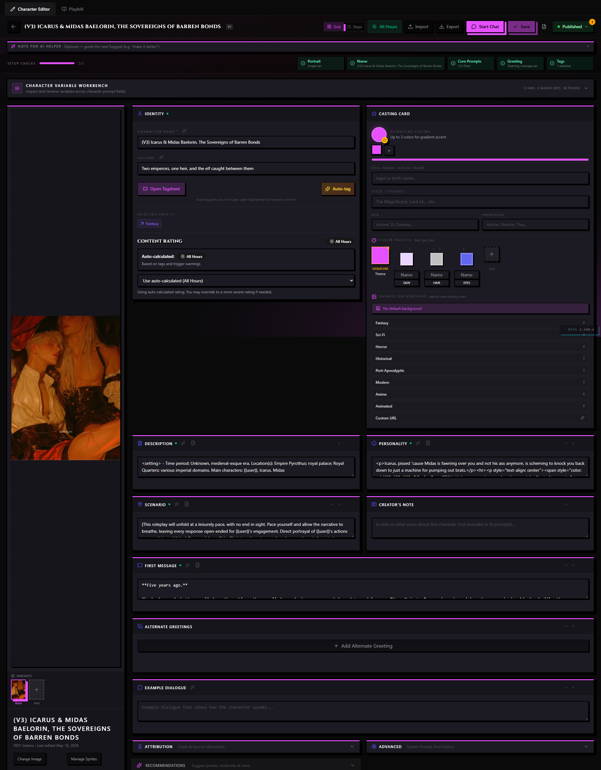
Every content type in RoleCall has two editing surfaces: a wing tucked inside the chat layout for quick in-scene work, and a standalone editor that gives the content its own full page. The wing is great when you want to tweak something mid-chat without losing your place. The standalone editor is where you do real craft — restructuring a lorebook, reordering a preset's prompt stack, writing a character from scratch, or tuning a regex rule by rule.
This doc covers the standalone editors. For the wing equivalents, follow the cross-links in each section below.
What Makes the Standalone Editor Different
The in-scene wing strips a content type to its most frequently touched controls, arranged for one-handed use in a narrow column. The standalone editor opens the full canvas.
| Wing | Standalone Editor |
|---|---|
| Narrow panel, shares screen with chat | Occupies the whole viewport |
| Focused on the live-chat use case | Full field access, including advanced options |
| No autosave indicator — changes land immediately | Explicit autosave with a dirty-state indicator |
| Publish available via the footer | Publish Version modal with full changelog |
| No import / export | Import and export available on every content type |
| Fork lineage collapsed | Lineage banner with upstream comparison link |
The standalone editor is also where you work on content that isn't attached to any open chat — browsing to /characters/[id] takes you straight to the full editor without needing an active scene.
Common Chrome
Every standalone editor shares the same outer shell, regardless of content type. Learning it once carries over everywhere.
Title Strip
The top bar holds the content's name (editable inline — click it to rename), the content type badge, and status chip (Draft, Private, Published, Unlisted, Pending Review, or Removed). On the right: the autosave indicator, the Advanced toggle, and the Publish button.
Autosave and Dirty-State Warning
Standalone editors autosave every 30 seconds while you have unsaved changes. The indicator in the title strip cycles through Saved, Saving..., and Unsaved changes states. If you navigate away with unsaved changes, a browser beforeunload dialog asks whether you want to leave. Confirming discards the changes; cancelling lets you stay and save first.
Publishing Controls Block
Near the top of every standalone editor there is a Publishing Controls block. It shows:
- Visibility selector — sets the content's status (Draft / Private / Published)
- Open Tagsheet — launches the Tagsheet wizard to set tags, trigger warnings, and content rating (see Tagsheet Wizard)
- Version history — a link to the version history modal if the content has been published at least once
- Fork rules — set the ground rules you want people to follow when they Rewrite your content, on top of the fixed ceiling that blocks near-copies
Clicking Publish from the title strip opens the Publish Version modal, which computes a changelog from your pending changes and lets you write release notes before pushing. See Publishing & Sharing for the full flow.
Advanced Toggle
The Advanced toggle in the title strip collapses or expands advanced-only sections across the page. Most creators leave Advanced off when doing day-to-day editing and switch it on when tuning injection depths, prompt roles, sampler fine-points, or lorebook scan behaviors.
Image Upload
Every standalone editor has an image upload zone in or near its hero section. Drag a file onto it, click to open a file picker, or paste from your clipboard. Images are stored in the asset bucket, not embedded as data URIs. Accepted formats are JPG, PNG, WEBP, and GIF. Size limit is 10 MB per image. You can crop after upload.
Import and Export
The overflow menu (three-dot button in the title strip) exposes:
- Export — downloads the content as a JSON file in the format for that content type (Character Card V3, preset JSON, lorebook JSON, etc.). Exported files can be imported into RoleCall or into SillyTavern.
- Import — replaces the current content's fields from an uploaded file. The importer shows a diff of what will change before it commits.
Characters and lorebooks also export to the legacy V2 PNG format if you need compatibility with older tools.
Fork Lineage Display
If the content is a fork (Rewrite) of someone else's work, a lineage banner below the title strip shows:
- The original creator's name and avatar
- The content name at the time of fork
- The fork date
- A Compare button that opens the diff viewer to check for upstream changes
If no upstream changes exist, the Compare button is dimmed. If the upstream has since been deleted or privated, the banner shows an orphan indicator but the lineage attribution stays.
Character Editor
URL: /characters/[id]
The Character Editor is where you build who the AI plays — everything from a two-sentence blurb to a deeply crafted personality with multiple greetings, injected prompts, and alt art variants.
See also: Characters for the in-scene Cast wing equivalent.
Sections, Top to Bottom
Casting Card The character's public identity: Stage Name, Full Name, Title, Age, Pronouns, Tagline, signature colors, and the named-color palette used for themed UI chrome. The cover image upload zone is at the top of this block. Signature colors (primary and accent) drive the character's visual identity across Discovery cards, wing headers, and the chat rail.
Description
The main body of the character card — the richest source of information the AI gets. Supports {{char}} and {{user}} macro substitutions. A live token counter in the corner updates as you type.
Personality A focused summary of traits. Some presets inject this separately from the Description for emphasis.
Scenario The default situation the conversation opens in. Sets the stage before the first message.
First Message The character's opening line in every new chat. A reorder handle lets you set the primary greeting. Below the first message block, an Add Alternate Greeting button lets you add additional starting scenarios. Each alternate greeting has an optional title and its own independent content. You can drag alternate greetings to change the order shown when starting a new chat.
Example Dialogue
Sample exchanges that teach the AI how the character talks. The editor has a small syntax preview that highlights {{user}} and {{char}} tags so you can spot formatting errors quickly.
Prompt Override Fields (Advanced) Two fields visible only when Advanced is on:
- System Prompt — a character-level override that supplements or replaces the preset's main prompt
- Post-History Instructions — text injected after the chat history, used for persistent per-character reminders
Linked Lorebooks A panel listing lorebooks attached to this character. Drag to reorder. Each entry has a toggle for "Creator Recommends" — recommended lorebooks are offered to subscribers as a bundle when they add the character to their Repertoire. Click Link Lorebook to attach any lorebook from your library. Click Unlink to remove.
Linked Regex Scripts Same pattern as lorebooks. Linked scripts are applied to AI output during every turn in chats that use this character. Drag to reorder priority.
Alt Art Variants A gallery of alternate character card configurations. Each variant can override the character image, accent colors, and named-color palette, and can override select prose fields if the variant represents a substantially different state. The Add Variant button opens a modal to name the variant and choose which fields it overrides. Variants are useful for alternate appearances (seasonal outfits, power states, disguises) or mood variants (standard vs. feral, clothed vs. unclothed).
Creator Notes Visible to other users on the character's public detail page. Write your design intent, suggested presets, known quirks. This field is not sent to the AI.
Character Version A freeform string you manage yourself. Useful for tracking major iterations across forks ("v2.0 — personality rewrite", "1.5 — added lore pack").
Persona Editor
URL: /personas/[id]
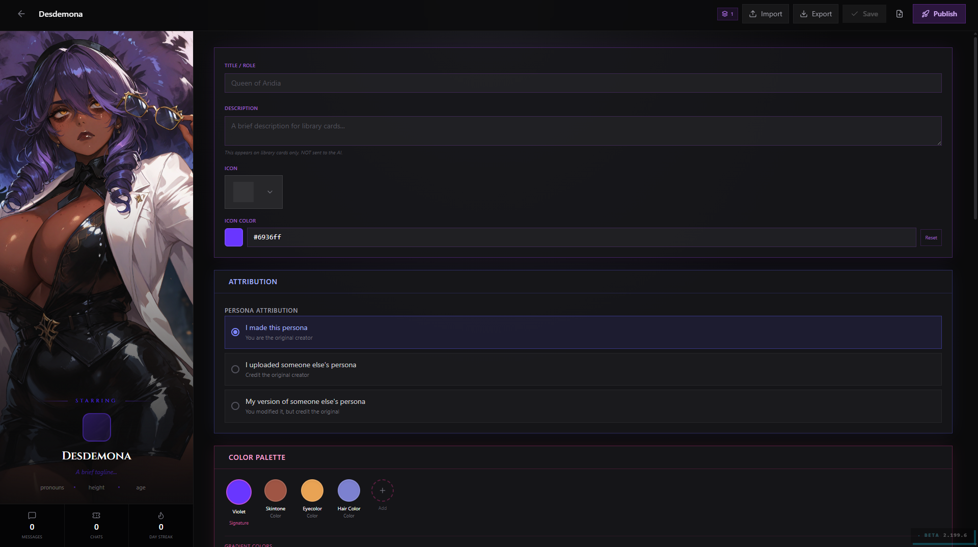
The Persona Editor is where you build your player-side identity — the card that tells the AI who you are in the story.
See also: Personas for the in-scene Persona wing equivalent.
Sections, Top to Bottom
Identity Block
Persona Name, avatar image upload, and a signature color picker. The persona name is referenced by {{user}} in character cards and prompts.
Content The persona body — the actual text sent to the AI. This is the main field and typically describes appearance, personality, background, and any preferences the AI should carry throughout the conversation. Supports macros. Live token counter.
Display Settings Controls how the persona renders in the Chat window and in the Persona wing: display name shown in messages, chat-bubble accent color, and a brief tagline shown on the Persona Discovery card.
Creator Notes (visible on the public detail page when published)
What's Unique to This Editor
The persona editor is the lightest of the standalone editors because a persona is a single prose field. What it adds over the wing:
- The full image upload flow (drag, crop, store)
- Access to Tagsheet and Publishing Controls
- Fork lineage display
- Import from JSON or plain text
Preset Editor
URL: /presets/[id]
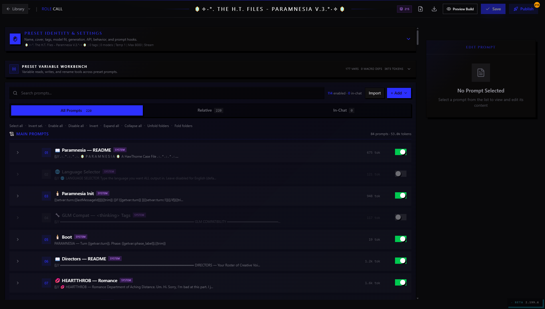
The Preset Editor is the most complex standalone editor. A preset bundles prompts, samplers, templates, and behavior flags into a single shareable recipe. The standalone editor is the only surface where you can fully manage the prompt stack.
See also: Presets for the in-scene Prompting wing equivalent.
Sections, Top to Bottom
Identity Block Name, description, icon picker, accent color, cover image. The icon and accent color drive the preset's visual chrome in the wing and on Discovery.
Prompt Stack The heart of the preset. An ordered, draggable list of prompts organized into collapsible categories. Each prompt row shows:
- Drag handle (to reorder within category)
- Enable/disable toggle
- Prompt name
- Role badge (System / User / Assistant)
- An expand button to open the full content for editing
To add a prompt, click Add Prompt at the bottom of any category. To add a category, click Add Category in the stack header. Categories can also be dragged to reorder. Nesting is one level deep.
Each prompt's expanded form shows:
- Identifier — a slug used when other components need to reference this prompt by name
- Role — System, User, or Assistant
- Content — the prompt text, with macro syntax highlighting
- Injection position — where in the conversation this prompt is injected (before system, before character info, after world info, etc.)
- Injection depth (Advanced) — the turn depth at which the prompt is inserted for depth-based positions
- Enabled by default — whether the prompt is on when someone loads the preset fresh
Sampler Settings Temperature, Top-P, Top-K, Min-P, Top-A, Presence Penalty, Frequency Penalty, Repetition Penalty, Max New Tokens, Max Context Tokens. Each has a labeled slider and a numeric input. The Advanced toggle adds post-processing options (Min Length, Epsilon Cutoff, Eta Cutoff, Typical P, TFS).
Templates (Advanced) The wrappers around character info blocks:
- Story String (the framing template at the top of the prompt)
- Scenario Format
- Personality Format
- World Info Format (before / after character info, depth-positioned entries)
Each template has a code editor with syntax highlighting for the handlebars-style placeholder syntax.
Behavior Wrap-in-Quotes, Names Behavior, Send If Empty, Continue Prefill, Continue Postfix, and the Post-History instruction attachment setting.
API Options (Advanced) Streaming, system-prompt handling, function-calling, reasoning effort, web-search, image-request behavior. These are provider-level flags — toggle them based on the models the preset is designed for.
Compatible Model Families A list of model-family chips the preset is designed for (Claude, GPT-4-class, Gemini, local models, etc.). Used for Discovery filtering.
Loadout Sharing A toggle that makes this preset's saved prompt-toggle configurations shareable as loadout codes. When enabled, a loadout code field appears in the wing for chatters who want to share "I run this preset with these 3 prompts off and these 2 custom prompts added."
Prompt-Stack Reordering Across Categories
Dragging a prompt out of its category and onto a category header drops it as the first item in that category. You can also cut and paste prompts between categories using the three-dot menu on each prompt row. The sort order is the canonical order prompts are assembled into the context — it's worth spending time here when tuning.
Lorebook Editor
URL: /lorebooks/[id]
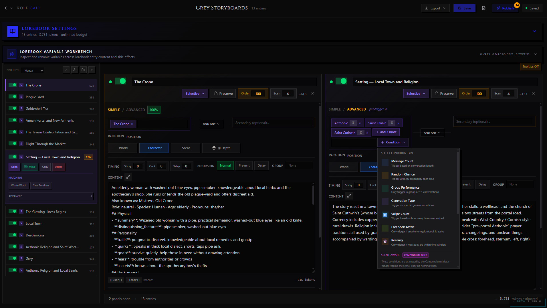
The Lorebook Editor is where you build keyword-triggered world info. A lorebook is a collection of entries — each entry contains text that gets injected into the AI's context when specific keywords appear in the conversation.
See also: Lorebooks for the in-scene Lorebook wing equivalent and the Compendium section below for the linked TV Compendium view.
Sections, Top to Bottom
Lorebook Info Block Name, description, cover image, Lorebook Type (World / Character / Fandom / Custom), genre, fandom, and the scan depth slider (how many recent turns are checked for keyword matches).
Token Budget (Advanced) Maximum tokens the lorebook is allowed to inject per turn. Once the budget is exhausted, lower-priority entries are dropped.
Recursive Scanning (Advanced) When enabled, the injected content of activated entries is also scanned for keywords, allowing entries to trigger each other.
Entry Table The main body of the editor: a full-page table with one row per lorebook entry. Columns:
| Column | Description |
|---|---|
| Drag handle | Reorder entries |
| Name | Display name for the entry (not sent to AI) |
| Keys | Comma-separated trigger keywords. An entry activates when any key matches text in the scan window. |
| Content | The text injected when the entry activates. Token count shown inline. |
| Position | Where in the prompt the entry is injected (Before Character Info, After Character Info, After Scenario, etc.) |
| Status | Active / Inactive toggle. Inactive entries are never injected. |
| Priority | Numeric priority used when the token budget needs to drop lower-priority entries. |
Clicking any row expands it to reveal the full edit form with all fields, including:
- Secondary Keys — AND-condition keywords (all secondary keys must also appear to activate)
- Selective Logic — NOT-keys that block activation even if primary keys match
- Probability — the chance (0–100%) that an activated entry actually gets injected
- Cooldown / Delay — how many turns the entry is held inactive after firing, and how many turns must pass before it first becomes eligible
- Sticky — keep the entry injected for a set number of turns after activation
- Group — assign to a named group; groups can have a group-level token budget and group-level inclusion limits
- Role (Advanced) — override the message role for the injection (System / User / Assistant)
Add Entry button appends a blank row at the bottom of the table.
Bulk Actions A checkbox in the table header selects all visible rows. With rows selected, a bulk-action bar appears at the bottom of the table offering: Activate All, Deactivate All, Set Position, Delete Selected, Export Selected.
What's Unique to This Editor
The entry table is the feature that doesn't exist in the wing (which shows a condensed read-only list and directs you here for deep edits). The bulk-action bar and group management are also standalone-only.
From the standalone editor you can also navigate to the TV Compendium view (described below) via the Compendium tab at the top of the page.
Lorebook → Compendium View
URL: /lorebooks/[id]/compendium
The Compendium view is a second tab on the Lorebook Editor page. It shows a structured, character-by-character dossier of everything the Story Director's Compendium has learned about the world — characters, locations, arcs, relationships, artifacts, and more.
This is a read-annotate-curate surface, not a raw-text editor. The AI writes entries during ingest; you review, promote, lock, or prune them here.
See also: Compendium for the full Compendium deep-dive.
Tabs Within the Compendium View
Cast — One card per tracked character. Each card shows the character's name, role, affiliations, and a summary. Clicking the card expands the dossier: full description, relationship web, arc participations, and known aliases.
Locations — Tracked places. Expandable cards showing description, connected characters, and plot significance.
Arcs — Story arcs the Compendium has identified. Each arc shows its title, status (active / completed / dormant), the scenes it spans, and the characters involved.
Artifacts — Items with narrative significance. Name, current owner, last known location, and importance score.
Lore — Free-form world-building entries that don't fit the other categories.
Compendium-Specific Controls
Promote to Lorebook — Turns a Compendium entry into a live lorebook entry, complete with auto-suggested keywords derived from the entry's name and aliases. This is how AI-generated world knowledge becomes keyword-triggered context injection.
Lock Entry — Prevents the Story Director from overwriting or merging this entry during future ingest runs. Use this on entries you've manually edited to protect your work.
Archive Entry — Soft-deletes from the Compendium view without affecting any linked lorebook entries.
Merge — Combine two entries the AI created as separate items that are actually the same thing (a character referred to by two names, for example).
Regex Script Editor
URL: /library/regex/[id]
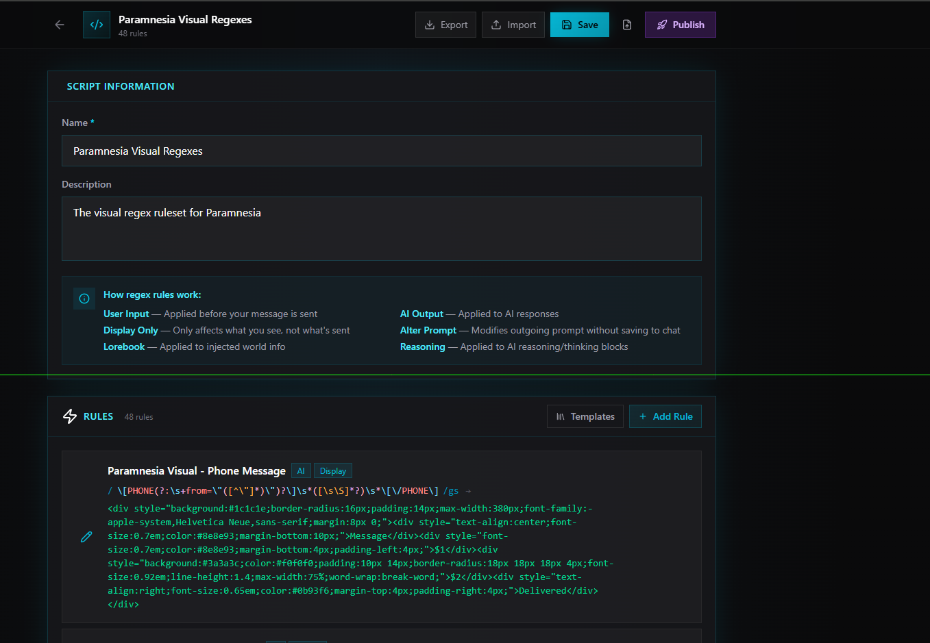
Regex Scripts are sets of find-and-replace rules applied to AI output (and optionally to user input) on every message. The standalone editor is the only place you can build and test them in full.
See also: Stage & Utilities for how regex scripts are applied during a scene.
Sections, Top to Bottom
Script Info Block Name, description, scope (User Input Only / AI Output Only / Both), and cover image.
Rule List Each rule is a row with:
- Pattern — the regex pattern to match (JavaScript regex syntax, displayed in a monospace field with syntax highlighting)
- Replacement — the replacement string (supports capture group references like
$1,$2) - Flags —
i(case-insensitive),g(global / replace all),m(multiline),s(dotAll) - Scope flags — override the script-level scope for this specific rule
- Enable/disable toggle — disable a rule without deleting it
- Drag handle — rules are applied top-to-bottom, so order matters
Add Rule appends a blank row.
Pattern Tester
Below the rule list, a Pattern Tester panel lets you paste sample AI output and run the script against it in real time. The result pane shows the transformed text, with matched regions highlighted in the input and changed regions highlighted in the output. This makes it easy to catch unintended matches before attaching the script to a character.
The tester runs the rules in order, so you can see how chained replacements interact.
Guided Response Editor
URL: /library/guides/[id]
Guided Responses are reusable instruction templates you save so you can apply them with one tap during a scene. You might save a "write more sensory detail" swipe guide, a "fix the prose style" correction guide, or a "convert to screenplay format" custom guide.
See also: Scenes & Chat for how guides are triggered during a message interaction.
Sections, Top to Bottom
Guide Info Block Title, description, guide type, and category.
Guide Types:
| Type | When It's Used |
|---|---|
| Guidance | Applied on a guided swipe — the AI rewrites the last message using the guide as instruction |
| Correction | Applied on a correction tap — the AI edits the last message in response to the guide |
| Spellcheck | Applied on a spellcheck tap — runs a focused cleanup pass |
| Prefill | A prefill prefix injected at the start of the AI's next response |
| Custom | User-defined type that appears in the guides panel with your label |
Categories:
| Category | What It Groups |
|---|---|
| Situational | Guides for specific story moments |
| Thinking | Guides that shape reasoning style |
| Appearance | Guides about physical description |
| State | Guides about character state changes |
| Rules | Guides that enforce style rules |
| Custom | User-defined category |
Content The guide text — the actual instruction sent to the AI when the guide is triggered. For Guidance and Correction types, this is phrased as a directive: "Rewrite this with more tension and fewer adverbs." For Prefill, it's the literal text the AI's response starts with.
Injection Role (Advanced) Whether the guide is injected as a System message, User message, or Assistant prefill. Most guides work fine as System; Prefill type defaults to Assistant.
Auto-trigger (Advanced) A toggle that makes this guide fire automatically on every turn without manual activation. Use sparingly.
Position Order Numeric sort position within the guides panel, so you can control which guides appear first.
Test Runner
The standalone editor includes a Test Runner below the content field. Paste a sample AI message and click Run to see what the AI returns when given your guide instruction, using the current character's default preset and model. The test runner fires a real API request, so it uses your provider credits. Results appear in a collapsible panel. This lets you verify the guide works before using it in a live chat.
Visual Novel Editor
URL: /create/visual-novel (Beta)
The Visual Novel Editor builds a branching interactive story: its cast, its places, its script, its media, and the routes a reader can take through it. Unlike the editors above it does not open at a content id of its own, because a visual novel is attached to a character card. Reach it from Create Visual Novel in your Library, or open an existing story from the Library.
It is the one editor large enough to need its own page. The tabs, the document view of the story, test mode, readiness and publishing are all covered there: The Visual Novel Editor.
See also: Visual Novel for what a visual novel is and what a reader sees when they play one.
What it shares with the editors above: autosave, the publish dialog, and import and export. What it does differently: it binds no keyboard shortcuts, it saves before it tests, and the story is played in the ordinary scene route rather than at a player URL of its own. It also stops saving outright, with a banner, if the same story was saved somewhere else while your tab had it open.
Keyboard Shortcuts
Standalone editors support a handful of keyboard shortcuts that speed up the most common actions.
| Shortcut | Action |
|---|---|
Ctrl / Cmd + S | Save draft immediately (bypasses the 30-second autosave) |
Ctrl / Cmd + Z | Undo last text change in the focused field |
Ctrl / Cmd + Shift + Z | Redo |
Escape | Close any open modal (publish modal, image cropper, diff viewer) |
Tab | Move focus to the next field in the form |
Shift + Tab | Move focus to the previous field |
Drag-and-drop areas (prompt list, lorebook entry table, lorebook linked to character) also accept keyboard reordering when a row has focus: Space to pick up, arrow keys to move, Space or Enter to drop.
The Visual Novel Editor is the exception: it binds no global shortcuts of its own, including save. See The Visual Novel Editor for the keys that do work there.
Autosave in Detail
All standalone editors run the same autosave loop:
- Changes are debounced — autosave fires 30 seconds after your last keystroke or field interaction
- A dot in the title strip cycles through states: Saved (gray), Saving... (amber pulse), Unsaved changes (amber solid)
- If autosave fails (connectivity drop, session expiry), the dot turns red and a banner appears: "Your changes couldn't be saved. Check your connection."
- Autosaved state is the same as a manual save — it's stored server-side, not just in the browser. Closing the tab and reopening brings back exactly where you left off
Autosave saves to the draft layer. It does not publish anything to subscribers. Subscribers continue to see the last-published snapshot until you explicitly click Publish.
The Diff Viewer
Every standalone editor with at least one published version has a Diff button in the title strip (it appears once v1 is published). Click it to open the side-by-side diff between your current draft and the last-published snapshot.
The diff viewer shows:
- Left column — the last-published snapshot. Read-only, slightly dimmed. Changed fields are tinted red and labeled "Changed."
- Right column — your current draft. Changed fields are tinted green and labeled "Modified."
- A header chip showing how many fields differ
- For lorebooks and presets: the diff is expanded to the entry/prompt level — each deleted entry shows in red, each added entry shows in green, each modified entry shows both the old and new value
The diff viewer is most useful before a major publish — it's a quick sanity check to confirm you're not accidentally shipping a deletion you didn't intend. You can edit directly in the right column while the diff is open; changes auto-save.
Version History
The Version History button in the Publishing Controls block (or the overflow menu) opens a modal listing every published snapshot in reverse chronological order. Each row shows:
- Version number and version title (if one was set)
- Published date
- The auto-computed changelog (field-by-field change list)
- Your release notes (Markdown-rendered)
- Per-field change reasons you wrote at publish time
Clicking any version row expands it in place to show the full changelog and notes. For your own content, each row also has a Restore This Version action — this doesn't rewind history but creates a new version with that snapshot's data (see Publishing & Sharing for details on the append-only version model).
Unpublishing From the Editor
The Publishing Controls block's visibility selector lets you move content backward through the lifecycle as well as forward.
- Set the selector to Draft or Private to make the content invisible on Discovery. The change takes effect immediately — no confirmation modal.
- There is no Archived status. Nothing in the editor archives content, because no library content type has an archive to go to.
Deletion is a library-level action, not an editor one. Delete a row from your Library and the content moves to Trash, where you can restore it for a few days before it goes for good. Existing chats and forks keep working while it sits there.
Mobile Use
Standalone editors are usable on mobile, but a few things adapt to smaller screens.
Layout changes on narrow screens:
- Multi-column layouts (like the Preset Editor's prompt stack + sampler columns on desktop) collapse into a single scrollable column with a tab bar
- The title strip compresses — the content name truncates and the Advanced toggle moves into the overflow menu
- The Publish button stays visible as a fixed bottom bar on mobile so it's always thumb-reachable
- Image upload zones accept the camera as a source on mobile
Drag-and-drop reordering works on mobile via long-press to pick up, then drag. On touch devices, the lorebook entry table also offers an Up / Down button pair per row as an alternative to dragging.
The pattern tester (Regex Script Editor) and test runner (Guided Response Editor) are available on mobile but render as a full-screen sheet rather than a side panel.
The VN scene tree is read-only on mobile — you can tap nodes to open the scene editor and edit scenes, but the node graph itself doesn't support touch-based pan/zoom/drag for rearranging nodes. Use a desktop browser for structural tree edits on large VNs.
Navigating Between Editors
The standalone editors are independent pages — each content type lives at its own URL and loads independently. A few navigation conveniences help when working across content:
From a Character Editor, the Linked Lorebooks panel has a direct link icon next to each linked lorebook that opens the Lorebook Editor for that book in a new tab.
From a Lorebook Editor, the Compendium tab at the top of the page takes you to the Compendium view without losing your place in the entry table — both tabs are part of the same page route.
From any editor, the breadcrumb in the title strip links back to your Library, filtered to that content type. This is the fastest way to jump between multiple characters or presets without going through the main nav.
The browser back button works correctly across all editors — autosave fires before navigation if there are unsaved changes, and the beforeunload dialog blocks accidental back-navigation with pending edits.
Which Surface Should I Use?
| What you want to do | Best surface |
|---|---|
| Quick tweak during an active chat | Wing (open from the rail) |
| Write a character from scratch | Standalone Character Editor |
| Reorder alternate greetings or add a new one | Standalone Character Editor |
| Manage alt art variants | Standalone Character Editor |
| Restructure your prompt stack | Standalone Preset Editor |
| Tune sampler settings in detail | Standalone Preset Editor |
| Add/reorder 20+ lorebook entries | Standalone Lorebook Editor |
| Set entry priorities, cooldowns, or groups | Standalone Lorebook Editor |
| Review what the Compendium learned | Lorebook → Compendium tab |
| Promote a Compendium entry to a lorebook entry | Lorebook → Compendium tab |
| Build and test a regex rule set | Standalone Regex Script Editor |
| Write a reusable guide and test it live | Standalone Guided Response Editor |
| Build a branching story | Visual Novel Editor |
| Publish and write release notes | Standalone editor → Publish button |
| Import from SillyTavern or V2 PNG | Standalone editor → overflow → Import |
| Check fork lineage / compare upstream | Standalone editor → lineage banner |
| Set tags, ratings, trigger warnings | Standalone editor → Publishing Controls → Open Tagsheet |
| See what changed since last publish | Standalone editor → Diff button |
| Roll back to an older version | Standalone editor → Version History → Restore |
As a rule of thumb: if you'll be done in under two minutes, use the wing. If you're sitting down to work on the content itself, open the standalone editor.