Playbill
Your account, settings, and helpers
Playbill
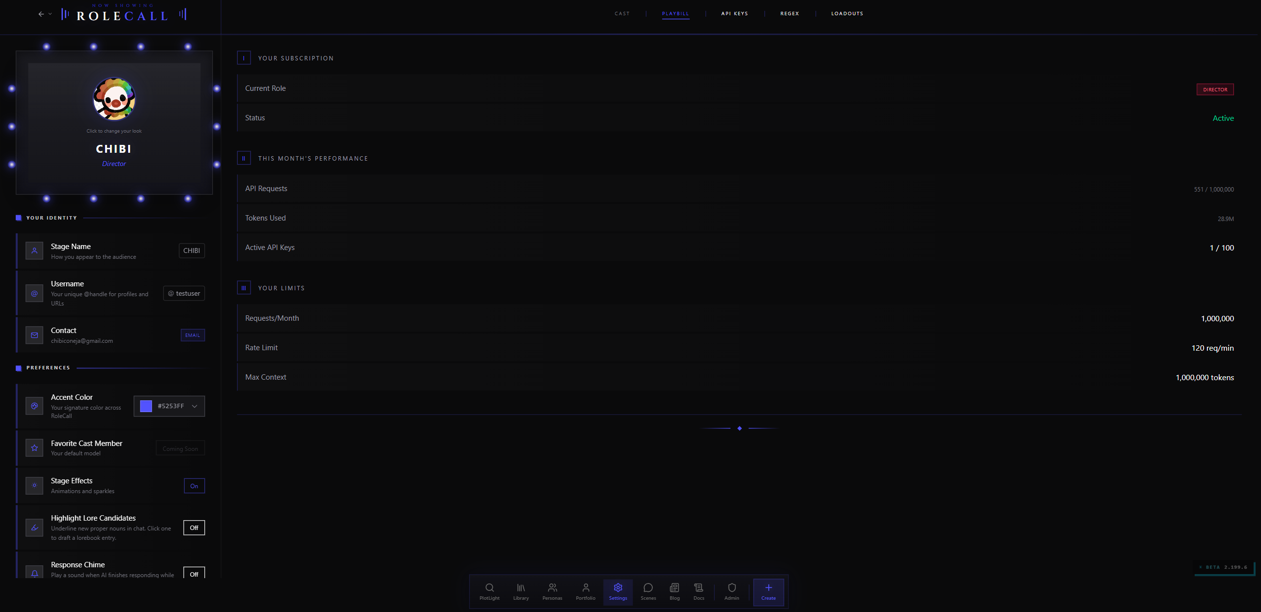
The Playbill is your character's visual showcase page — a freeform canvas where you arrange images, text, social links, announcements, and more into a personalized layout. Think of it like a digital scrapbook or mood board that visitors see when they view your character on Discovery.
Unlike a traditional profile with fixed fields in a fixed order, the Playbill gives you a blank canvas. You place blocks wherever you want, layer them on top of each other, resize them freely, and style every detail. The result is a unique visual identity for each character — as minimal or elaborate as you like.
What Is a Playbill?
Every character in RoleCall can have a Playbill attached to it. When someone visits your character's page on Discovery, the Playbill is what they see — your character's front door.
A Playbill is made up of blocks arranged on a canvas. Each block is a self-contained piece of content: an image, a paragraph of text, a set of social links, an announcement banner, a gallery of your other characters. You drag them around, resize them, stack them, and style them until the page looks the way you want.
Key concepts:
- Freeform canvas — No rigid grid. Blocks go wherever you place them, at whatever size you choose.
- Multiple pages — A single Playbill can have multiple pages, like flipping through a booklet. Page one might be the character's mood board, page two their backstory timeline, page three your social links and announcements.
- Layered — Blocks have depth. You can place a text block on top of an image, layer a glow effect behind a heading, or overlap elements for creative compositions.
- Live preview — Switch between editing and preview mode to see exactly what visitors will see.
Building Your Playbill
Building a Playbill is a visual, tactile process — more like arranging a collage than filling out a form. There are no wrong answers. Some creators build elaborate multi-page showcases with overlapping images, animated text, and cinematic effects. Others prefer a clean, minimal layout with one hero image and a few lines of text. Both approaches work.
Here's the step-by-step workflow:
Step 1: Open the Editor
Navigate to your character in the editor and click the Playbill tab. You'll see the canvas — a dark workspace where your blocks will live.
If this is a new character, the canvas starts empty. If you've worked on this Playbill before, your existing blocks appear exactly where you left them.
Step 2: The Toolbar
Along the top of the canvas, you'll find the block toolbar. This is where you add new blocks to your Playbill. Each button in the toolbar creates a different type of block:
[ Text ] [ Image ] [ Heading ] [ Social ] [ Card ] [ Divider ]
Click any button to drop a new block onto the canvas. It appears at a default size and position — you'll move and resize it next.
Step 3: Moving Blocks
Click and drag any block to reposition it on the canvas. Blocks snap to a percentage-based horizontal position, so they'll look consistent across different screen sizes. The canvas grows vertically as needed — there's no bottom edge, so you can make your Playbill as tall as you want.
Blocks are constrained to the canvas width (they can't go off the left or right edges), but you have complete freedom within those bounds.
Step 4: Resizing Blocks
Grab any corner or edge of a block and drag to resize. Blocks have a minimum size to keep things readable, but you can make them as large as you need. Width is measured as a percentage of the canvas (so a block at 50% width will always take up half the page), while height is measured in pixels.
Step 5: Selecting Blocks
Click a block to select it. When selected, the Edit Panel appears on the side — this is your control center for customizing that block's content, style, background, border, glow, and animation. More on the Edit Panel below.
Step 6: Preview Mode
Toggle Preview to see your Playbill exactly as visitors will see it — no selection handles, no grid lines, no toolbar. This is the final product. Switch back to edit mode to keep working.
Block Types
Every block on your Playbill is one of these types. Each serves a different purpose and comes with its own set of style presets.
| Block Type | What It Does | Best For |
|---|---|---|
| Text | A rich text block with multiple template styles | Body copy, descriptions, lists, FAQs, timelines, code snippets |
| Image | A single image with display variant options | Character art, mood images, banners, photo-style compositions |
| Heading | A styled title or section header | Organizing your Playbill into sections, big dramatic titles |
| Social | Links to your social platforms | Twitter/X, Discord, YouTube, Ko-fi, and more |
| Card | Multi-purpose content cards | Announcements, bio cards, spotlight features, nameplates |
| Divider | A visual separator between sections | Breaking up content, adding breathing room |
Think of block types as the raw ingredients. The style presets within each type are the recipes — they transform the same ingredient into very different results.
Example Layout
Here's what a typical Playbill might look like, block by block:
┌──────────────────────────────────────────────────┐
│                                                  │
│  ┌────────────────────────────────────────────┐  │
│  │         Image (Default, full-width)         │  │
│  │         Character's hero art                │  │
│  └────────────────────────────────────────────┘  │
│                                                  │
│  ┌─────────────────┐  ┌──────────────────────┐  │
│  │ Card (Nameplate) │  │ Text (Paragraph)     │  │
│  │ "Elara Voss"     │  │ A short intro about  │  │
│  │ "Ranger, Scout"  │  │ the character...     │  │
│  └─────────────────┘  └──────────────────────┘  │
│                                                  │
│  ┌────────────────────────────────────────────┐  │
│  │         Divider (Gradient)                  │  │
│  └────────────────────────────────────────────┘  │
│                                                  │
│  ┌──────────────────────┐  ┌─────────────────┐  │
│  │ Text (Timeline)       │  │ Image (Polaroid) │  │
│  │ Character history     │  │ Mood photo       │  │
│  │ with dates            │  │ "First patrol"   │  │
│  └──────────────────────┘  └─────────────────┘  │
│                                                  │
│  ┌────────────────────────────────────────────┐  │
│  │         Social (Icons Only)                 │  │
│  │         Twitter  Discord  Ko-fi             │  │
│  └────────────────────────────────────────────┘  │
│                                                  │
└──────────────────────────────────────────────────┘
This is just one possibility. Your layout can look completely different.
Styling Blocks
Every block can be visually customized through two systems: quick-pick style presets and the detailed Edit Panel. Together, they give you a "fast path" for quick looks and a "deep path" for pixel-level control.
The Style Picker
When you select a block, the first thing you see in the Edit Panel is the Style section. This shows thumbnail previews of all available visual presets for that block type.
Click a preset to instantly change the block's look. Your content (text you've written, images you've uploaded, links you've added) is preserved — only the visual presentation changes.
This is the fastest way to experiment. Drop in a Text block, try "Paragraph," then "Drop Cap," then "Callout," then "Timeline" — all in seconds. Your content carries over between styles.
The Edit Panel
The Edit Panel is the detailed control center that appears when you select any block. It's organized into collapsible sections:
| Section | What It Controls |
|---|---|
| Style | Visual preset picker — the quick-switch thumbnails |
| Content | The block's actual data — text fields, image uploads, link URLs, etc. |
| Background | Background color, gradient, or preset pattern behind the block |
| Border | Border style (none, solid, or accent-colored), plus custom border color |
| Glow Effect | Ambient glow around the block — soft, neon, pulsing, layered, inner, or rainbow |
| Animation | Looping motion — pulse, float, bounce, shake, shimmer, or fade |
| Border Effects | Advanced border styling with animated or decorative border treatments |
| Image Effects | Photo filters, shape masks, and color overlays (image blocks only) |
| Container Effects | Frosted glass, soft shadows, gradient backgrounds, hover animations |
| Text Effects | Gradient text fills, outlines, glow presets (text and card blocks only) |
Not every section appears for every block type. Image Effects only show up on image blocks. Text Effects only show up on blocks that contain text. The panel adapts to what's relevant.
Image Blocks
Image blocks are the visual centerpiece of most Playbills. Drop in character art, mood images, banners, or decorative photos, then choose how they're presented.
Think of image blocks as picture frames with different personalities. The same photograph looks completely different in a clean frameless mount, a Polaroid snap, a gilded gallery frame, or a cinematic overlay with text. The variant you choose tells the viewer how to feel about the image before they even look at it.
The Six Variants
| Variant | What It Looks Like | Good For |
|---|---|---|
| Default | Clean image, no decoration | Hero images, full-bleed art |
| Polaroid | White border with a caption area underneath | Nostalgic photo feel, annotated images |
| Rounded | Circular or rounded corners with a thin border | Avatars, profile photos, soft compositions |
| Frame | Decorative frame around the image | Formal or artistic presentation |
| Overlay | Text layered on top of the image with a gradient scrim | Hero banners, title cards, atmospheric text-over-image |
| Blur | Softly blurred image with an opacity scrim | Background textures, atmospheric depth, behind-the-scenes layers |
Frame Styles
The Frame variant has six sub-styles, each giving the image a different decorative border:
| Frame | Description |
|---|---|
| Elegant | Thin, refined border with subtle shadow |
| Shadow Box | Deep shadow creating a floating, gallery-hung effect |
| Tape | Decorative tape corners — like a photo pinned to a board |
| Film Strip | Sprocket holes along the edges, like a frame of 35mm film |
| Neon | Glowing border in your accent color |
| Torn Edge | Rough, irregular edges like a ripped photograph |
Overlay Modes
The Overlay variant lets you place text directly on top of your image. The overlay type controls how the text contrasts against the image:
| Overlay | Effect |
|---|---|
| Gradient | A smooth gradient fade from transparent to dark, usually bottom-up |
| Dark | An even dark scrim across the entire image |
| Light | A light, milky overlay — good for dark text on bright images |
| Accent | A scrim tinted with your character's accent color |
| Cinematic | Horizontal letterbox bars — like a widescreen film frame |
You can position the overlay text at center, bottom-left, bottom-center, or top-left, and control the scrim opacity with a slider.
Image Fit
All image variants support three fit modes:
| Fit | Behavior |
|---|---|
| Cover | Image fills the entire block, cropping if needed to avoid empty space |
| Contain | Entire image visible, with empty space if the aspect ratio doesn't match |
| Fill | Image stretches to fill the block exactly (may distort) |
Text Blocks
Text blocks are the most versatile block type. They cover everything from simple paragraphs to structured lists, timelines, and callouts. If image blocks are the face of your Playbill, text blocks are the voice.
Text Templates
When you add a Text block, you choose a template that determines the layout and formatting:
| Template | What It Creates |
|---|---|
| Paragraph | Standard body text — the workhorse for descriptions and prose |
| Drop Cap | A paragraph with a large, styled first letter — storybook opening feel |
| Tip Callout | An info box with an icon and colored accent — "Pro tip: ..." |
| Warning Callout | Same layout as tip, but with warning-colored accent |
| Note Callout | A softer callout for general notes and asides |
| FAQ Item | Question-and-answer format — bold question, indented answer |
| Timeline | A vertical timeline with dates and events — perfect for character history |
| Code Block | Monospace text with syntax highlighting — for the technically inclined |
| Prose Example | A styled writing sample with genre tags — show off your character's voice |
| Bullet List | A clean bulleted list — abilities, traits, rules, anything list-worthy |
Each template comes with sensible defaults. Add the block, pick the template, then replace the placeholder text with your own content.
Text Styling
Regardless of which template you choose, text blocks support:
- Font selection from a curated font library
- Font size ranging from extra-small to extra-large
- Font weight — normal, medium, semibold, bold, or extra-bold
- Text alignment — left, center, or right
- Custom colors for titles, body text, accents, and highlights
Heading Blocks
Headings are specialized text blocks designed for section titles and visual anchors. They're bigger, bolder, and come with decorative touches that regular text blocks don't offer.
Heading Styles
| Style | Description |
|---|---|
| Heading + Line | Title text with a colored accent line underneath — clean and editorial |
| Heading + Badge | Title with a small badge label (like "NEW" or "FEATURED") — draws attention |
| Gradient Heading | Title text filled with a two-color gradient — vibrant and eye-catching |
Headings are intentionally simple. They exist to organize your Playbill into clear sections and give the viewer's eye a place to land. When paired with a divider block below them, headings create clean visual sections that make even complex Playbills easy to navigate.
The gradient heading style works particularly well for character names and dramatic titles. Pair it with a text glow effect for extra impact.
Social Blocks
Social blocks display links to your platforms outside RoleCall. They auto-detect the platform from the URL and show the appropriate icon.
Social Styles
| Style | Layout |
|---|---|
| Icons Only | Large platform icons in a row — minimal and clean |
| Pills | Rounded pill-shaped buttons with icon and platform name |
| Stacked (Linktree) | Vertical stack of full-width link buttons — like a personal link page |
| Cards | Grid of cards with icon, platform name, and description text |
Supported Platforms
Social blocks recognize Twitter/X, Discord, YouTube, Ko-fi, Twitch, Instagram, TikTok, Bluesky, Tumblr, DeviantArt, ArtStation, Pixiv, GitHub, Reddit, and more. Each platform gets its own branded icon. If you add a URL that doesn't match a known platform, it'll display with a generic link icon.
You can customize the icon size, spacing, column count, and hover effects. The Cards style also supports a short description per link — useful for things like "Join my Discord server" or "10K subscribers."
Card Blocks
Card blocks are the Swiss army knife of the Playbill. They handle announcements, bio cards, nameplates, identity tags, and spotlight features — anything that combines a header, content, and optional image into a structured layout.
Card Styles
| Style | What It's For |
|---|---|
| Glass Banner | A frosted-glass announcement bar — great for news and updates |
| Spotlight Card | A stacked highlight card with emphasis styling — featured content |
| Confetti Alert | A celebratory announcement with festive decorations — milestones and celebrations |
| Bio - Classic | Centered avatar, name, pronouns, and bio text — personal introduction |
| Nameplate | Name and title/role in an elegant layout — character identity at a glance |
| Identity Tags | A row of pill-shaped tags — personality type, pronouns, alignment, zodiac sign |
| Bio - Horizontal | Avatar and bio side-by-side — compact personal introduction |
Cards are perfect for the blocks that don't fit neatly into "image" or "text" — the structural pieces that give your Playbill personality and context.
Bio Cards vs. Announcements
The Card block type serves two very different purposes depending on which style you pick:
Bio cards (Classic, Horizontal, Nameplate, Identity Tags) are about identity — who is this character or creator? They're static, informational, and typically placed near the top of the Playbill.
Announcements (Glass Banner, Spotlight, Confetti Alert) are about communication — what's new, what's featured, what's happening? They're timely, attention-grabbing, and work well anywhere on the page.
You can use both on the same Playbill. A Bio - Classic card at the top introduces the creator, while a Glass Banner further down announces a new alternate art release or an upcoming character update.
Divider Blocks
Dividers are simple horizontal separators. They add visual breathing room between sections of your Playbill.
The Gradient Divider style fades a colored line from your accent color to transparent, creating a subtle break without feeling heavy. Dividers are intentionally minimal — they're the whitespace between your content, not content themselves.
A common pattern is to place a heading block, then a divider directly below it, then your content blocks. This creates a clear "section" feel:
┌────────────────────────────────────┐
│  Heading: "Backstory"              │
├────────────────────────────────────┤
│  ────────── gradient divider ──────│
├────────────────────────────────────┤
│  Text block with character lore... │
└────────────────────────────────────┘
Visual Effects
This is where the Playbill really shines. Every block supports a layered effects system that lets you add depth, motion, texture, and atmosphere. Effects are additive — you can stack multiple effects on the same block, and they combine visually.
Think of effects like layers in a photo editing app. Each one adds something on top of what's already there. A block might have a frosted glass container, a neon glow around its edges, a hover-lift interaction, and a fade-in entrance animation — all at the same time.
Image Effects
Available on image blocks only. These modify the image itself before it's displayed.
Photo Filters
Pre-built filter presets that change the mood of your image instantly:
| Filter | Effect |
|---|---|
| None | Original image, unmodified |
| Vintage | Warm, faded tones with slight sepia — old photograph feel |
| Matte | Lifted blacks, reduced contrast — modern editorial look |
| Black & White | Full desaturation — classic monochrome |
| Vivid | Boosted saturation and contrast — punchy, energetic |
| Cool | Blue-shifted color temperature — calm, distant, ethereal |
| Warm | Orange-shifted color temperature — cozy, inviting, golden |
| Cinematic | Teal-and-orange color grading — Hollywood blockbuster feel |
For fine control, you can also adjust individual filter properties:
| Property | Range | What It Does |
|---|---|---|
| Brightness | 0-200% | Lighten or darken the image |
| Contrast | 0-200% | Increase or flatten the tonal range |
| Saturation | 0-300% | Boost or mute colors |
| Sepia | 0-100% | Add warm, brownish toning |
| Hue Rotate | 0-360 degrees | Shift all colors around the color wheel |
| Blur | 0-20 pixels | Soften the image |
| Grayscale | 0-100% | Partial or full desaturation |
Shape Masks
Crop your image into non-rectangular shapes:
| Shape | Result |
|---|---|
| None | Standard rectangular image |
| Circle | Circular crop — classic avatar shape |
| Vignette | Soft, dark fade around the edges — draws focus to the center |
| Diamond | Diamond/rhombus crop |
| Hexagon | Six-sided geometric crop |
| Star | Star-shaped crop — playful and decorative |
| Custom | Upload your own PNG mask image for any shape you want |
Masks support feathering (soft vs. hard edges), size adjustment, and position offset — so you can center the crop exactly where you want it.
Color Overlays
A semi-transparent color layer applied on top of the image with blend mode control:
| Blend Mode | Effect |
|---|---|
| Normal | Flat color tint |
| Multiply | Darkens, good for moody overlays |
| Screen | Lightens, good for dreamy washes |
| Overlay | Enhances contrast while adding color |
| Color Dodge | Bright, blown-out highlight effect |
| Color Burn | Deep, saturated shadow effect |
| Soft Light | Subtle tinting that preserves detail |
| Difference | Psychedelic color inversion |
| Hue | Changes the hue while keeping brightness and saturation |
There are 16 blend modes in total — enough to achieve almost any photographic or artistic effect.
Container Effects
Available on all block types. These affect the block's outer container — the box that wraps your content.
Frosted Glass (Glassmorphism)
Creates a translucent, blurred background effect — like looking through frosted glass or a fogged window. You can fine-tune several properties:
| Property | What It Controls |
|---|---|
| Blur | How much the background behind the block is blurred (0-30 pixels) |
| Tint Color | The color of the glass — dark glass, light glass, colored glass |
| Tint Opacity | How opaque the tint is — more opacity means less see-through |
| Saturation | Boost the color saturation of the blurred background for a more vivid look |
| Border Opacity | A subtle bright edge around the glass for that classic frosted look |
Frosted glass looks especially good when blocks overlap — the content behind bleeds through with a soft, diffused look. A text block with frosted glass placed on top of an image block creates a particularly elegant composition.
Soft Shadows (Neumorphism)
Adds embossed or pressed shadows to the block, creating a tactile, almost 3D appearance — like buttons molded from clay. Control the shadow distance, softness, and light direction angle. Toggle between raised (embossed, the block appears to pop out from the canvas) and pressed (inset, the block appears pushed into the surface).
Mesh Gradients
A multi-color gradient background built from positioned color blobs. Unlike a simple two-color gradient, mesh gradients create organic, flowing color transitions — like watercolors bleeding into each other on wet paper.
You define a base color and then add individual blobs, each with its own color, position (x/y), and size. The blobs blend together to create a unique, non-repeating gradient background. This is particularly effective for large blocks where a simple flat color or two-color gradient would feel monotonous.
Hover Animations
Effects that trigger when a visitor hovers their mouse over the block:
| Hover Effect | What Happens |
|---|---|
| Lift | Block rises slightly, casting a deeper shadow |
| Scale | Block grows slightly larger |
| Glow | A soft glow appears around the block |
| Tilt | Block tilts in 3D toward the cursor |
Adjust the intensity and transition speed for each effect.
Entrance Animations
Effects that play when the block first scrolls into view:
| Animation | What Happens |
|---|---|
| Fade In | Block fades from invisible to visible |
| Slide Up | Block slides upward from below |
| Slide Left | Block slides in from the right |
| Scale In | Block grows from a smaller size |
| Blur In | Block starts blurry and sharpens into focus |
| Bounce In | Block drops in with a playful bounce |
Set the duration and delay to stagger animations across your Playbill — so blocks appear one after another as the viewer scrolls down the page.
Text Effects
Available on text and card blocks. These modify how the text itself renders.
Gradient Text
Fill your text with a two-color gradient instead of a solid color. Set the start color, end color, and gradient angle. This works especially well on headings and large text — small body copy can look muddy with gradients.
Text Outline
Add a visible stroke around each letter. Control the stroke width and color. Enable hollow fill to make the text interior transparent, leaving only the outline — a striking effect for decorative titles.
Glow Presets
Pre-built text shadow and glow effects:
| Preset | Effect |
|---|---|
| None | No text shadow |
| Neon | Bright, colorful glow — like a neon sign |
| Soft Glow | Subtle, diffused light behind the text |
| 3D Shadow | Hard offset shadow creating a 3D letterpress look |
| Letterpress | Inset shadow — text appears stamped into the surface |
| Fire | Warm, flickering glow — text burning from within |
Each preset has a default glow color, but you can override it with any color you choose.
Block Glow Effects
Every block — not just text — supports an ambient glow around its outer edges. This is separate from text glow and container effects. It's the halo of light that makes a block pop off the dark canvas.
| Glow Type | Effect |
|---|---|
| None | No glow |
| Soft | Gentle, diffused halo — subtle depth |
| Neon | Bright, sharp-edged glow — electric and vivid |
| Pulse | Glow that throbs gently — alive and breathing |
| Layered | Multiple stacked glow layers for depth |
| Inner | Glow on the inside edges of the block — like light leaking in |
| Rainbow | Cycling rainbow colors — for when subtlety isn't the goal |
Glow color defaults to your character's accent color, which keeps things visually cohesive without extra work.
Block Animations
Every block supports a looping animation effect — a persistent motion that plays continuously, not just on hover or scroll.
| Animation | Motion |
|---|---|
| None | Static, no movement |
| Pulse | Gently scales up and down — a breathing effect |
| Float | Drifts slowly up and down — weightless, dreamy |
| Bounce | Hops in place — energetic and playful |
| Shake | Rapid side-to-side jitter — attention-grabbing or chaotic |
| Shimmer | A highlight slides across the surface — sleek and polished |
| Fade | Cycles opacity up and down — ghostly, appearing and disappearing |
A little animation goes a long way. One or two animated blocks on a page can feel dynamic and alive. Animating everything can feel overwhelming — use with intention.
Borders
Every block supports three border modes:
| Border Style | Description |
|---|---|
| None | No visible border |
| Solid | A thin border in a color you choose |
| Accent | A border in your character's accent color — stays in sync if you change the accent |
When solid or accent is selected, a color picker appears so you can fine-tune the exact color. The accent option is convenient because it automatically matches your character's signature color, keeping the Playbill visually coherent.
Beyond basic borders, the Border Effects section in the Edit Panel offers advanced decorative border treatments — animated borders, gradient borders, and other ornamental styles that go beyond a simple solid line.
Backgrounds
Every block supports a background behind its content. The background picker offers preset options:
- Transparent — No background, the canvas shows through
- Solid color — A single flat color
- Gradient — A smooth blend between colors, with angle control
- Preset patterns — Pre-designed backgrounds you can apply with one click
For image blocks, the background is usually irrelevant (the image covers the block). For text, cards, and social blocks, a well-chosen background can make content much more readable and visually grounded.
Layers and Depth
Blocks on the Playbill canvas have depth — they can overlap, and you control which block appears on top.
How Layering Works
Every block has a z-index — a number that determines its stacking order. Higher numbers appear in front of lower numbers. When you drag blocks to overlap, the layering order determines which one you see on top.
┌──────────────────────────────────┐
│                                  │
│   ┌─────────────┐               │
│   │  Image       │  ← z-index 1 │
│   │  (behind)    │               │
│   │       ┌──────┴───────┐      │
│   │       │  Text         │      │
│   └───────│  (in front)   │      │
│           │  ← z-index 2  │      │
│           └───────────────┘      │
│                                  │
└──────────────────────────────────┘
Think of z-index like a stack of papers on a desk. The paper on top covers the ones below it. You control which "paper" sits on top.
Managing Layers
The Layers Panel gives you a top-down view of all blocks on the current page, listed by their stacking order. From here you can:
- Bring Forward — Move a block one layer up
- Send Backward — Move a block one layer down
- Toggle Visibility — Temporarily hide a block while you work on blocks behind it
- Lock — Prevent a block from being accidentally moved or resized
This is especially useful when you have overlapping compositions — text on top of images, glow effects behind headings, or decorative blocks layered behind content blocks.
Multiple Pages
A Playbill can have more than one page. Each page is a separate canvas with its own set of blocks.
Think of pages like slides in a presentation or pages in a booklet. Visitors can flip between them to see different aspects of your character:
- Page 1: Character art collage with name and tagline
- Page 2: Backstory timeline and personality traits
- Page 3: Your social links, announcements, and gallery of other characters
Each page is independent — blocks on page one don't affect blocks on page two. You can have different color schemes, layouts, and moods per page.
Pages are a great way to handle the tension between "I want to show a lot" and "I don't want to overwhelm visitors." Put the most important content on page one — the character art, name, and hook. Then let curious visitors flip to page two and beyond for deeper content. First impressions happen on page one. Depth lives on the later pages.
Common Playbill Patterns
Here are a few popular layout approaches to inspire your own design:
The Hero Layout
One large image block spanning the full width at the top, with smaller blocks arranged below it. Simple, dramatic, and effective. The hero image does the heavy lifting, and everything below is supporting detail.
The Mood Board
Multiple image blocks at various sizes, overlapping slightly, with a mix of character art, aesthetic photos, and texture images. Minimal text. Feels like a Pinterest board or Tumblr aesthetic post. Works best with consistent color grading — use the same photo filter on all images.
The Character Sheet
Structured and informational. A nameplate card at the top, followed by organized sections with headings, text blocks for personality and backstory, a bullet list of abilities, and a timeline of key events. Clean borders, minimal effects. All business.
The Gallery Showcase
Designed for creators with multiple characters. A small profile card in the corner, with the rest of the Playbill filled with image blocks showing different characters or alternate arts. Social links at the bottom. The Playbill becomes a portfolio.
The Cinematic
Heavy use of overlay images with text, cinematic photo filters, frosted glass containers, and entrance animations. Dramatic, atmospheric, and immersive. Works especially well for dark fantasy, horror, and sci-fi characters.
The Link-in-Bio
Inspired by link tree pages. A profile card at the top, followed by a stack of social link blocks, a small announcement, and maybe one image. Functional, clean, and focused on connecting visitors to your other platforms. Great for creators who want their character page to double as a personal landing page.
Tips for Great Playbills
Keep It Focused
Three to five blocks per page is a sweet spot. Enough content to be interesting, not so much that it feels cluttered. If you have a lot to show, use multiple pages rather than cramming everything onto one.
Use Your Accent Color
Your character's accent color is automatically picked up by glow effects, accent borders, and some style presets. Choosing a strong accent color and letting it flow through the Playbill ties everything together visually without extra effort.
Mix Block Types
A Playbill that's all text feels like a document. A Playbill that's all images feels like a gallery. The most engaging Playbills mix types — a large image block next to a text callout, a heading above a row of social links, a card block overlapping an image.
Create Visual Hierarchy
Not everything should be the same size. Make your most important block (usually the character's main art or name) the largest. Supporting content (bio text, social links, stats) should be smaller. This guides the viewer's eye to what matters most.
Use Effects Sparingly
One block with a neon glow and pulse animation is dramatic. Every block with a neon glow and pulse animation is a headache. Pick one or two blocks to highlight with effects, and let the rest stay calm. Contrast is what makes the highlights work.
Preview on Different Sizes
Block widths are percentage-based, so they scale with screen size. But what looks balanced on a wide monitor might feel cramped on a narrow one. Preview your Playbill at different browser widths to make sure it holds up.
Use Overlapping for Depth
Don't be afraid to layer blocks. A text block overlapping the edge of an image, with the image slightly behind — that creates depth and visual interest you can't get from flat, non-overlapping layouts. The frosted glass container effect is particularly effective on overlapping blocks.
Start With a Template Style, Then Customize
Every block type comes with style presets that look good out of the box. Start by picking the preset closest to what you want, then tweak individual settings in the Edit Panel. This is much faster than building from scratch.
Let the Canvas Breathe
Resist the urge to fill every pixel. Empty space on the canvas isn't wasted — it's breathing room that makes the blocks you do have feel more intentional. A Playbill with three well-placed blocks and generous spacing looks more polished than ten blocks crammed edge-to-edge.
Match the Character's Mood
A horror character's Playbill should feel different from a bubbly slice-of-life character's Playbill. Use dark backgrounds, cinematic filters, and inner glow for something ominous. Use bright colors, rounded images, and bounce animations for something cheerful. The Playbill is an extension of the character's personality — let the design reinforce who they are.
Quick Reference
Block Type Cheat Sheet
| I want to... | Use this block |
|---|---|
| Show character art | Image (Default or Frame variant) |
| Write a character description | Text (Paragraph or Drop Cap) |
| Add a section title | Heading (any style) |
| Link my social platforms | Social (Icons Only or Stacked) |
| Make an announcement | Card (Glass Banner or Spotlight) |
| Introduce myself as the creator | Card (Bio - Classic or Bio - Horizontal) |
| Show my character's history | Text (Timeline) |
| List abilities or traits | Text (Bullet List) |
| Feature a writing sample | Text (Prose Example) |
| Answer common questions | Text (FAQ Item) |
| Display personality tags | Card (Identity Tags) |
| Show character name + title | Card (Nameplate) |
| Separate sections visually | Divider |
Effect Stacking
Effects layer on top of each other. A single block can have all of these simultaneously:
Block
├── Background (solid, gradient, or preset)
├── Border (none, solid, or accent)
├── Border Effects (animated/decorative borders)
├── Glow (soft, neon, pulse, layered, inner, rainbow)
├── Animation (pulse, float, bounce, shake, shimmer, fade)
├── Container Effects
│   ├── Frosted Glass
│   ├── Neumorphism (soft shadows)
│   ├── Mesh Gradient
│   ├── Hover Effect (lift, scale, glow, tilt)
│   └── Entrance Animation (fade-in, slide-up, etc.)
├── Image Effects (image blocks only)
│   ├── Photo Filter
│   ├── Shape Mask
│   └── Color Overlay + Blend Mode
└── Text Effects (text/card blocks only)
    ├── Gradient Text
    ├── Text Outline
    └── Glow Preset
You rarely need all of these at once. But knowing they exist means you can achieve almost any visual you can imagine.
Frequently Asked Questions
Can visitors interact with my Playbill? Visitors can view and scroll through your Playbill, click social links, and experience hover effects and animations. They cannot edit or rearrange anything — the canvas is read-only for everyone except you.
Do I need a Playbill for my character to appear on Discovery? No. Characters appear on Discovery based on their published status. The Playbill is an optional enhancement — a way to make your character's page more visually engaging. Characters without a Playbill still show their standard profile information.
What image formats can I use? Image blocks accept PNG and WebP files. For best results, use images that are at least as large as the block size you intend to use. Small images scaled up will look blurry.
Can I duplicate blocks? Yes. Select a block and use the duplicate option to create an identical copy with the same content, style, and effects. The copy appears offset from the original so you can reposition it.
How do I delete a block? Select the block and press the delete key, or use the delete option in the block's context menu.
Is there a limit to how many blocks I can have? There's no hard limit, but very large Playbills with many blocks (especially animated ones) may load slowly for visitors on older devices. Aim for quality over quantity.
Can I revert to a previous version of my Playbill? The Playbill saves as you work. There isn't a version history system — so if you're about to make dramatic changes to a Playbill you're happy with, consider duplicating your character first as a backup.
Do animations affect performance? Animations are implemented with efficient CSS, so they're lightweight. However, if you have many blocks all animating simultaneously (especially with glow effects and mesh gradients), visitors on older or lower-powered devices may notice some lag. If performance is a concern, limit animations to two or three blocks per page.
Can other people fork my Playbill? When someone forks your character, they get a copy of the Playbill along with all the character data. The fork includes the block layout, styles, and effects. However, image URLs point to your uploaded images — the forking user will typically replace images with their own.